Where am I

During my industry design project at Where Am I, I was apart of a team that was in charge of designing a short form video app for reviewing restaurants and services.
project overview
As the first UX team our startup encountered, we introduced design systems and processes to enhance the user experience. The client granted my team and I full control of the design of the app. Our focus was on creating the major screens with a cohesive design system and unique features across the platform. The final product resulted from a journey of education, collaboration, and iterative refinement, setting the stage for a more user-focused approach within the company.
role: Research & UX/UI duration: 4 weeks company: Where Am I
approach
As a team we tackled the project in three phases.
Discovery - White paper Research, User Interviews, Competitive Analysis, User Research, and Client Interviews
Ideation - Brainstorming and Downloading Findings and User Flows
Design - Collaborative Iteration, Wireframes, High Fidelity Screens
Research & discovery
The research process for this project entailed white paper research, user interviews, client interviews, and competitive analysis.
My team developed a dual strategy approach that involved educating clients on UX principles while prioritizing an inquisitive stance and asking numerous questions to comprehend their goals thoroughly. Simultaneously, we conducted interviews with content creators to gain insights into their perspectives. This combined strategy ensured a tailored UX strategy aligned with the client's vision and enriched by the input of key stakeholders in content creation.
Client Interviews
Conducting client interviews proves invaluable in grasping the strategy and business objectives of the project. These sessions serve as a priceless forum, allowing all stakeholders to voice their needs and concerns.
In the research phase, I actively pushed for additional client interviews to ensure a comprehensive understanding of the business aspect and to provide ongoing updates at crucial checkpoints.
This proved enlightening as it highlighted the distinctions between interviewing users and engaging with clients, offering valuable insights into both perspectives.
Starting our white paper research, our initial inspiration stemmed from the prevalence of short-form videos on platforms like TikTok and Instagram Reels. Seeking a deeper understanding, we interviewed foodie content creators and business establishments, gaining valuable insights into the nuances of content creation, user engagement, and the challenges faced in the dynamic landscape of short-form video content.
User Interviews
Key Points from Foodie Content Creators

“One feature that many people check is the caption section to find out more about business hours, locations, name, and areas. Hashtags are useful too!”
Psychology
Different button layout and unique features
Based on location not algorithm
Mobile app
Clean and simple design
Familiar framework to similar short form apps
Target audience 18-59 years old
Key Points
White paper research
Short-form video emerged on YouTube and Vimeo in the early 2000s.
It gained popularity around 2010 with the dominance of social media platforms like Instagram, Vine, and TikTok.
Short-form videos typically range from 15 seconds to 3 minutes, varying by platform.
In contrast, long-form videos are usually around 5 to 10 minutes in duration.
Short-form videos are known for being interactive, fun, and easy to digest.

Key Points from Business Establishments

“Location matters based on platform, mostly reviewing applications like Yelp gives the most advantage (Based on location and rating).”
No playback nor start button = less stressful due to automation.
No longer have power of choice, the more you use it, the more it personalizes (Follows Hick’s Law – more choices makes it harder to decide).

“Large amount of interaction happens in Save, and Share.”

“Comment section is mostly filled with tags.”
Competitive Analysis
Leverage findings to inform strategy and design decisions.
Research industry trends and frameworks within our domain and discover how we can differentiate ourselves from others.
Capture the user’s voice so that it can be used to inform the design process and strategy.
Discover the stakeholders view of success.
“Less is more, but make sure “less” is also important.”

“Mostly use social media to advertise specials, and events.”
A video-focused mobile application that enables users to make videos up to 3 minutes in length, accompanied by music.
Cons
Free-for-all videos creation application.
Navigate content via scrolling up and down, taking full advantage of the thumb zone.
Video content fills the screen = less distraction.
Thumb zone includes creators name, description, music, and reactions.
Variable rewards principle = keep scrolling in search of relevant content.
Goals
Key Points

“Comments are usually not reviews from content consumers, but rather a place where audiences can tag friends/family members.”

“Social media platforms give more reviews, but it is hard to narrow search or browse restaurants.”
Can swipe forever aka Infinite Scrolling.
Bottom sheet method for users to interact with content (Also in the thumb zone).
Auto captions - accessibility measurements for users hard of hearing.
Photosensitivity feature - allows users to skip photosensitive content.
Good video editing tools.
Swiping between different tabs (For You, Shop, Following) seems invisible and often missed by users.
For content consumers – difficulty accessing saved content.
Missed opportunity with gesture navigation/interaction.
Pros
…short-form videos are appealing to most content consumers because of the content’s influence of feeling of enjoyment and feeling of withdrawal. Most users repeatedly interact with short-form videos to maintain positive emotions or reduce negative emotions, which leads to addiction.
ResearchGate
Ideation
After the discovery phase we began downloading all our findings and leveraged them to define our goals and approach for the design. The brainstorming phase was our most collaborative portion of this project.
During the ideation phase we will brainstorm possible design solutions and define the user flow of the app.
User Flow
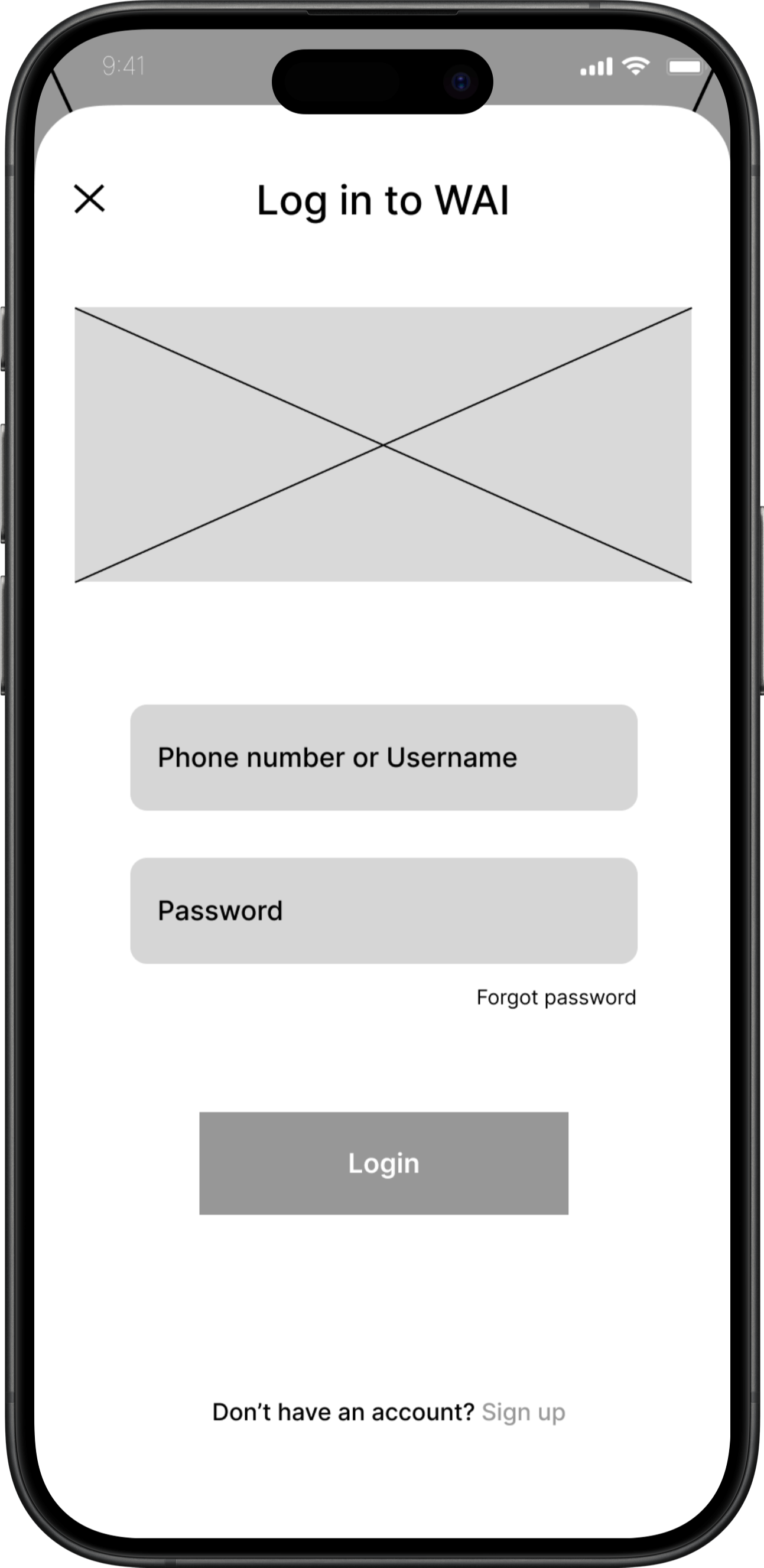
Registration
Login
lazy login
traditional login
Sign Up
lazy login
traditional sign up
Continue as guest
prompt to sign up or login

Early Sketches
For You Guest Sketches
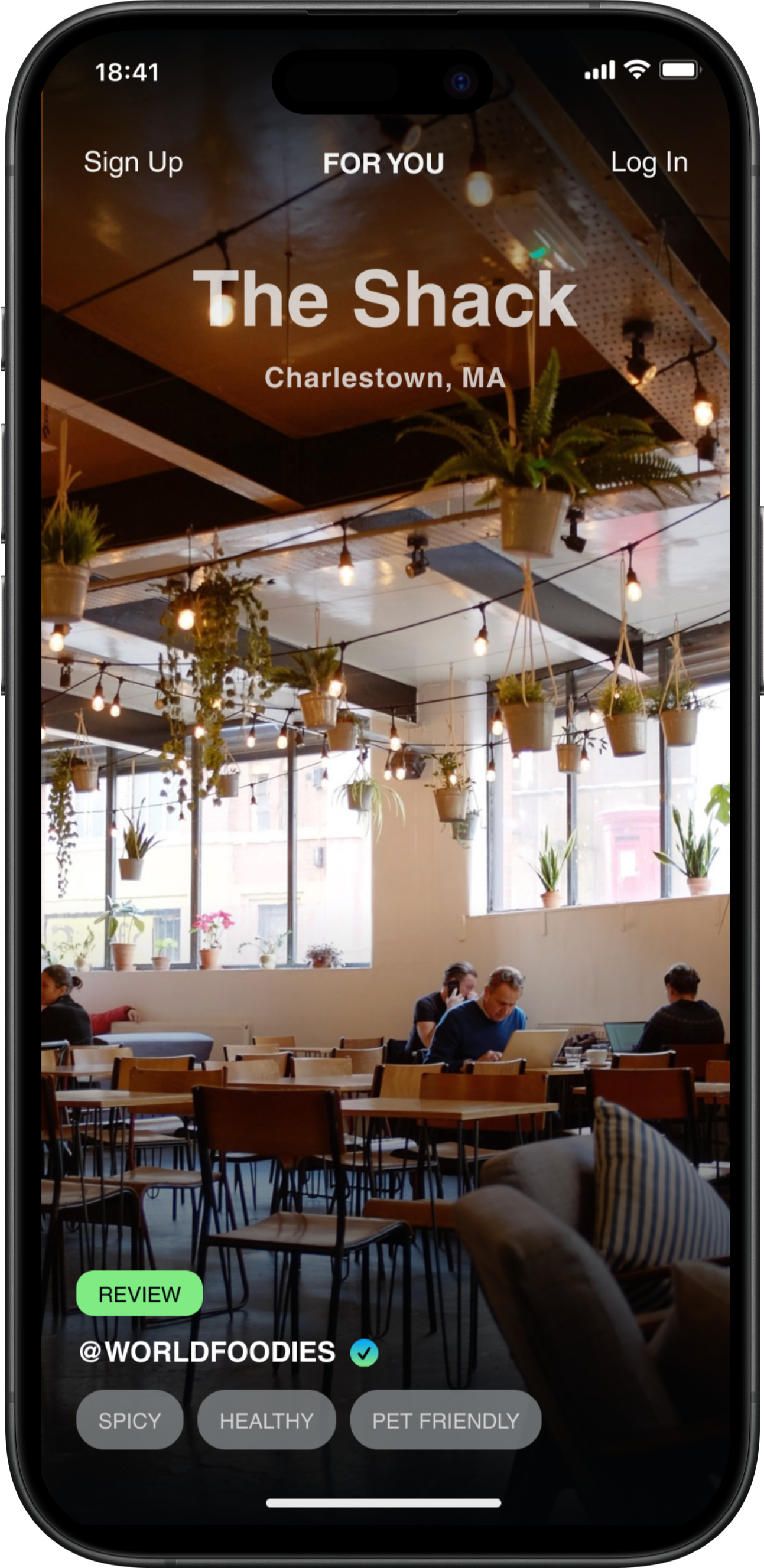
An interesting experience we wanted to implement for our guest users to let them get a taste of the app while not being a registered user.
This was a collaborative decision that would allow users to skip the learning phase of a new app and enjoy what the app has to offer for a limited time.
Goals
Understand what target audience wants and needs
Brainstorm ideas for a visually appealing and cohesive design that reflects the brand identity
Explore interactive elements that encourage users to discover experiences
Devise navigation structures and user flows that are intuitive and user-friendly
After consulting with the client and user interviews my team and I created a user flow, which incorporated the clients main focuses of the app:
Content Creator
Profile
Caption
Registration Sketches
The goal for these sketches were to create a flow for users that would ease the pressure of providing a lot of information to the app before discovering videos.
Users are given the option to manual input information, login or sign up through social media accounts, or continue as a guest and given 10 videos.
We reviewed the option of giving the guests the ability to experience the app with 10 free swipes before being prompted to login or sign up.


Content Consumer
Location
Map Area
Like
Share
Bottom sheet method
Pin
Comment
Bottom sheet method


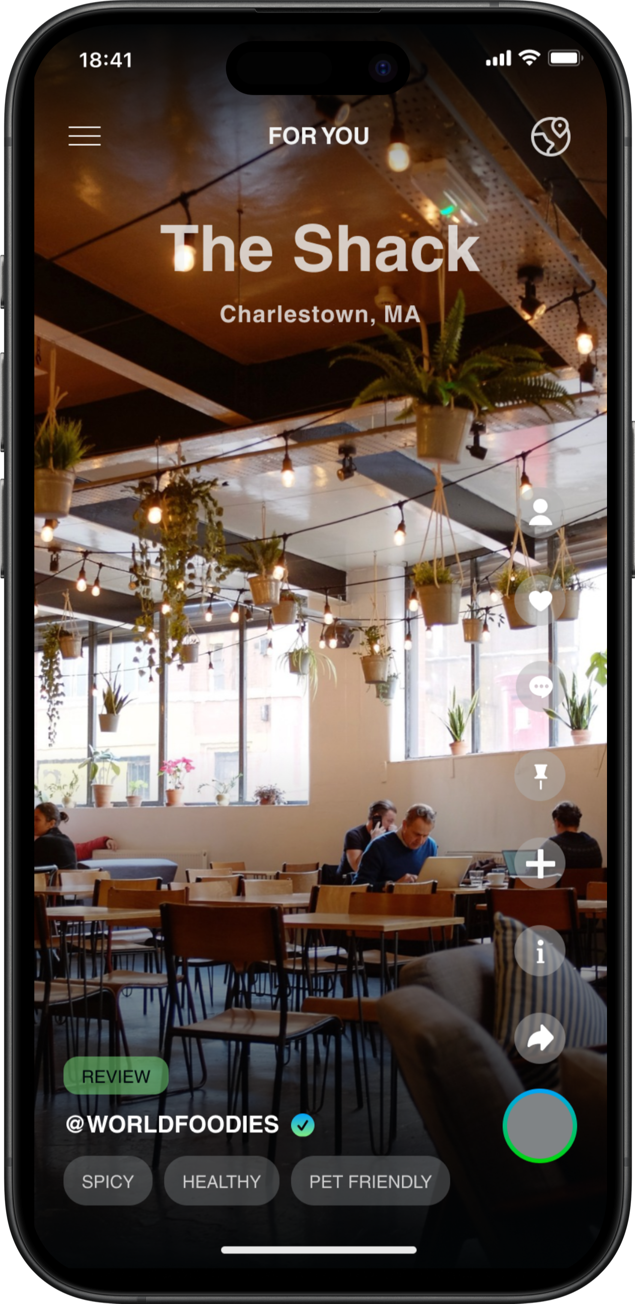
For You Sketches
For the For You page our main focus was freeing up real estate and creating a canvas for the videos to be the main focus for the consumers.
We wanted to create a unique but familiar experience for the users. Keeping in mind the clients goals of incorporating unique features, we created an interface that was free of distractions yet still having all the tools needed to engage with the video in thumbs reach for the users.


Design
After sketching and establishing user flows, we presented our deliverables to our client. We then moved into collaborative designing and iteration phase. The goal of this phase focused on wireframes, prototypes and high fidelity screens.
Low Fidelity Wireframes
After getting confirmation from our client we went ahead and delved into the next step in our design process and begin designing wireframes following our user flow.
Testing & Improvements

Here are a few screens that I did personally as my portion of the collaborative designing phase.

3 major improvements
In response to feedback from client and user testing, I quickly refined my designs over the next 24 hours, implementing 3 major design improvements.

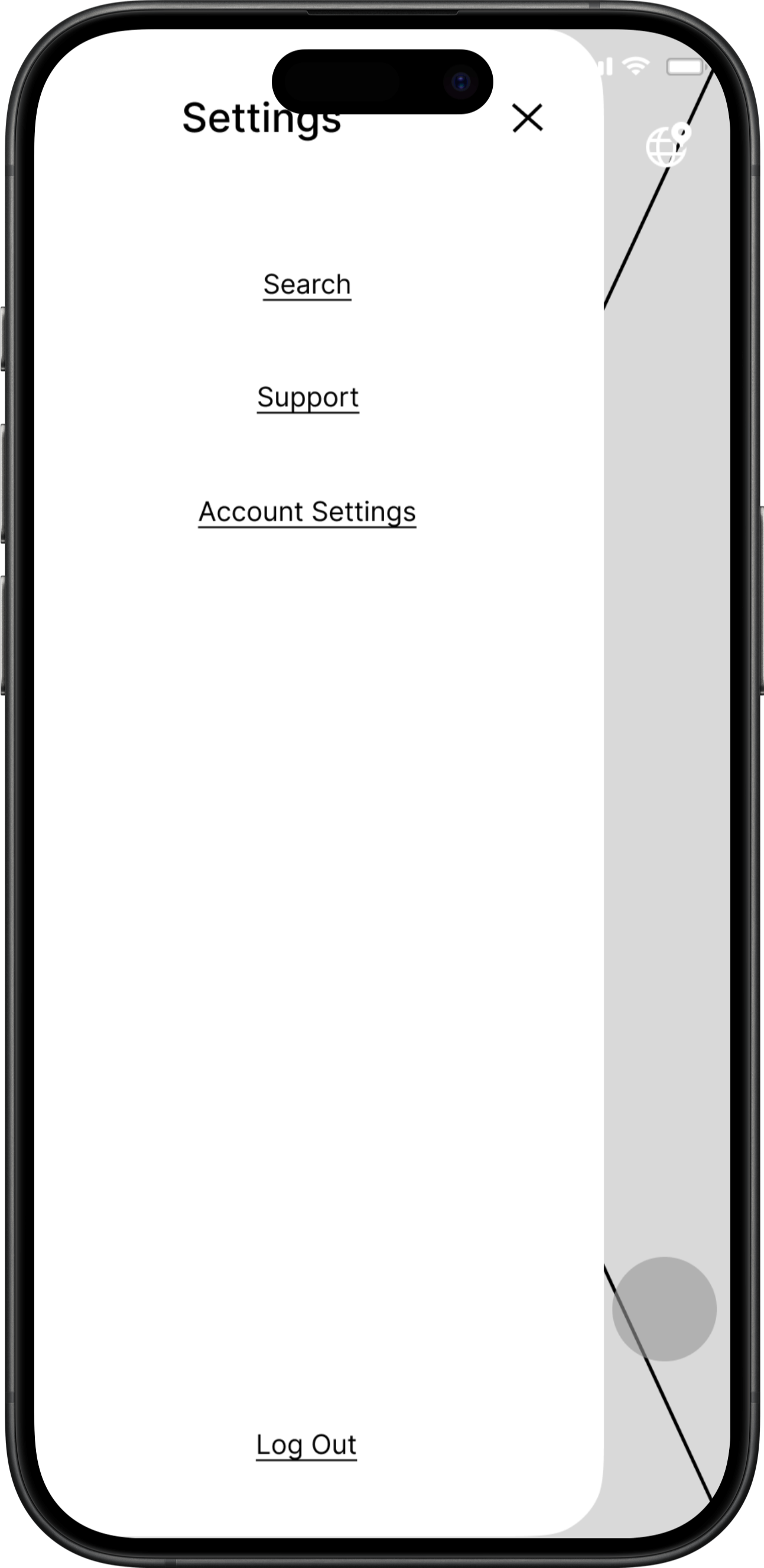
Discoverability
I discovered through testing that there was conflict of discoverability between two options.
Deletion of the search option under hamburger menu
One singular point of discoverability with the globe “discover” icon

Final Direction
The final prototype

Key Touchpoints
Iterate quick ideas collaboratively
Create wireframes
Create high fidelity screens and of the user interface and branding


Accessibility & functionality
Confusion was prevalent with the function of two buttons in the toolkit.
To curb confusion I scrapped the “more information” icon since user were familiar with tapping links in videos instead of going to an additional tool or button
Changed the “film” button in the toolkit to a video camera icon. The associate to filming was higher than with the “plus” icon for the “film” button
Registration
Users stated during testing that it felt like there were too many options in the sign up registration screen.
Created an input form for email or password if users were signing up manually.
Kept the lazy registration options but separately.


Conclusion
Working with a client for the first time as a UX designer, especially when tasked with crafting the initial designs for their app, is a rich learning experience. It involves not only creating innovative designs but also educating the client on the principles of UX. Somethings I appreciate doing well would be fostering a collaborative environment and effective communication with client. This resulted in a more holistic and refined app design. Things I would do differently:
More clear designated tasks and roles for team. During this project there were moments when teammates were confused on tasks that were designated to them. Next time I would confirm with each teammate on their comprehension of the tasks and roles designated to them before the end of team calls. I would also reach out in between team meetings to inquire if they need any assistance or guidance in reaching checkpoints.
Everyone comes from different backgrounds. We all are trying to make it in the industry as designers and all have different strengths and things we can work on in UX. Meeting people where they are is the best way to make it together.
Record each meeting. As much as I want to think I wrote down or remembered everything from a meeting, a lot of times we miss small things that wont be written down or in an email. So when I think this next call will be a very insightful call then I will come prepared and ready to record the meeting.